Hi there, I'm Jason.
I'm a User Experience Designer at Netskope, striving to craft the user experience for better cloud security.
I believe good design should be aesthetic, simplistic, dynamic, and ultimately, humanistic.
When I'm not designing, you can find me jamming out to YMO, wandering around on Wikipedia or hunting for a new recipe.
Master's Thesis
Individual Project
3 Months
(2015/02 - 2015/05)
Interview and Diary Studies
Competitive Analysis
Literature Reviews
Behavioural Prototyping
We all live with news, yet news industry is under a revolution - technology companies are changing the whole media landscape with unprecedented speed. Now with infinte information and fragmented sources, people now are reading less mainstream news and instead spending more time on more personalized information. But news has its values. People read news to get informed, practice social skills or even form a nation. News bring together the social consensus and encourage civic participation.
This project aims to bring readers back to mainstream news.
To better understand what current behaviour and perception of news readers, I spent 2 months conducting various user researches, including interviews, diary study, literature review and competative anlysis.
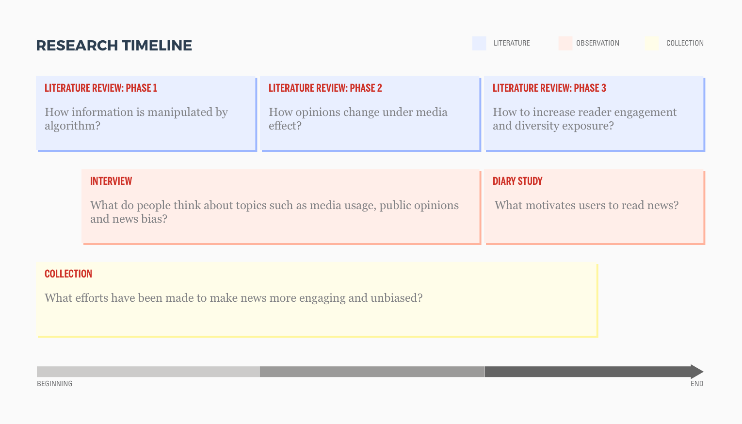
I have the following research findings:
1. People are mostly aware of bias in traditional news media, but not aware of Filter Bubble on internet.
2. The more engaged people are in particular news event, the more exposure to different opinions there will be.
3. High exposure to different opinions will help people to be more open-minded.
4. People reduced reading mainstream news because it is mistrustful, irrelevant and boring.
5. Reading mainstream news is helpful to encourage civic participation and cultivate global mindset.
6. Empower audience to explore news more proactively could help decrease Filter Bubble effect.
Inform
Readers should not only be informed by news content. Relevant and contextual information should also be provided to enrich the content.
Engage
News should be constructed in a way that it relates to readers, hence creating a more engaging experience to users.
Explore
The design should limit the information presented, while providing access for readers to discover by themselves.
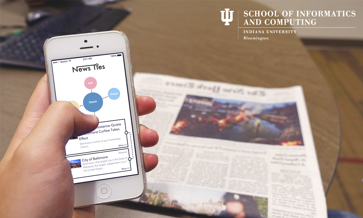
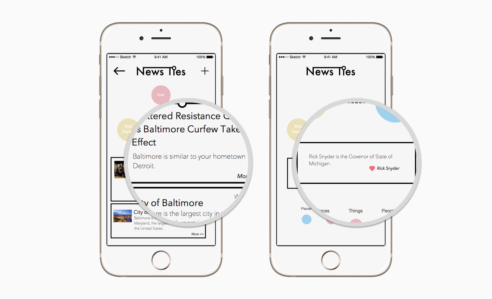
As the final concept, NewsTies divides all news topics into three categories: the places, the people and the things. Within each category, different topics will be stored by user input. User starts to explore everyday news by choosing one of his/her stored topics. Each topic is weakly tied with a piece of news and strongly tied with other three topics. The news exploration always starts with something familiar to something new.
Strong tie: connection that are direct, well-known and expected.
Weak tie: connection that are analogical, less-known and serendipitous.


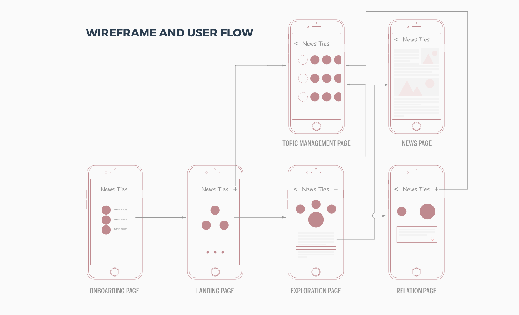
From the feedback I got from testing initial behavioral prototype, I visualized my concepts into low-fi wireframes and mapped out the overall user flow. The flow is simplified to the minimal and focuses on core features of news feed and discovery.
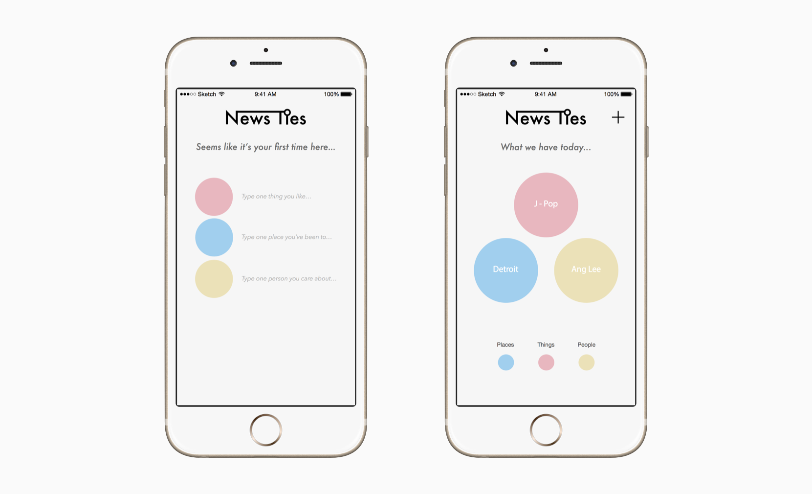
Everytime user opens NewsTies, three different user-stored topics will be presented to start a news exploration. First time users will be inivited to input three topics they like to start off.
Once users choose a topic, a piece of weakly-related mainstream news will be displayed along with three strongly-related topics. Also, contextual informaiton like wikipedia will be a good complementary source for readers to get a better idea.
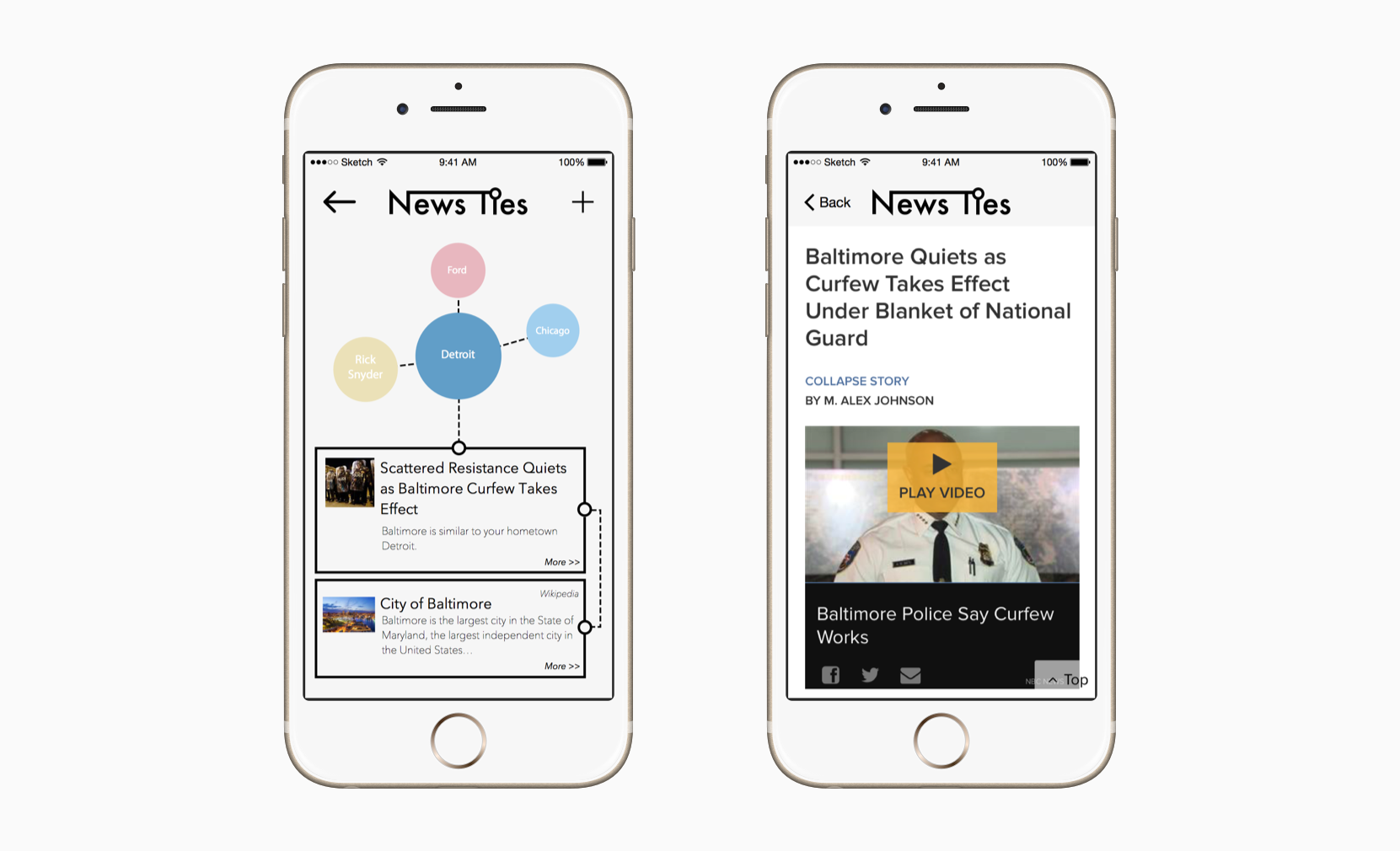
Both strong and weak ties will be explained to users. The intriguing connection between news topics will encourage further exploration and more news reading.
Through this project, I’ve tried to tackle the wicked problem of getting people back to mainstream news reading. I believe my final design uses an unconventional approach: rather than massive personalization, users are empowered to explore topics and encounter unexpected mainstream news. As the last school project, master thesis taught me to distill every piece of research into insightful design goals and hence create meaningful design.
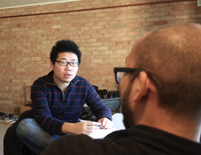
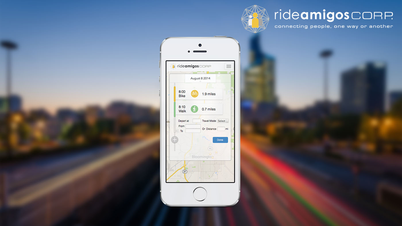
Image source: https://www.flickr.com/photos/david_bertho/13881064304/
Winner of the Rideamigos Rapid Design for Slow Change class design challenge (1st out of 12)
Drew Mind map for analysis
Co-ideated and sketched concepts
Co-designed interface
Built interactive prototype
RideAmigos is a leading transportation solution provider. One of its main service is to provide trip-tracking platform for government eco-awareness campaigns, like this case of Government of Utah.
Our challenge is, in two weeks, to design an improved trip-logging experience for their responsive webapp that encourages more user data input.
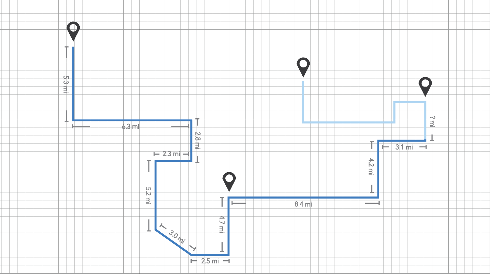
We closely examined the current RideAmigos trip-logging design using heuristic evaluation. Combining all issues we discoverd and client's goals, I illustrated a mind map for our team to gain a better understanding of the whole challenge.
For better communication, we met our clients in person on a weekly basis and also emailed them with follow-up questions. Through this process, we clarified some important concepts of RideAmigos trip-logging system.
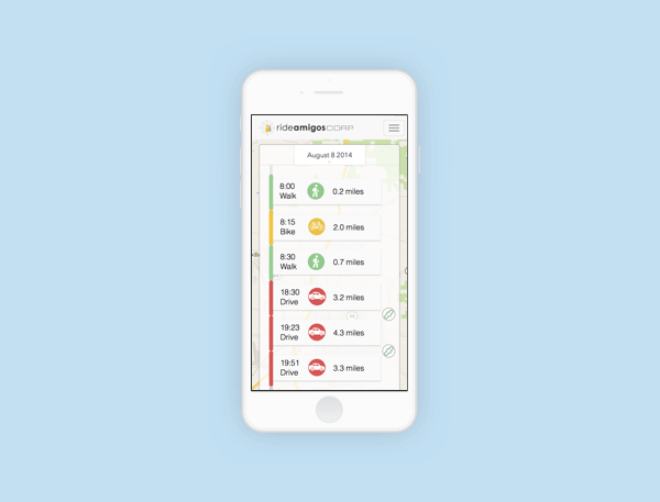
We took the form of capsule card to visualize "a trip", with all information (travel mode, departure time and distance) included. By doing so, we fully utilized the space of mobile screen and also prevented potential confusions of whether the length of lines is propotional to duration or distance.
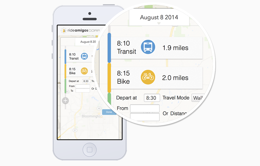
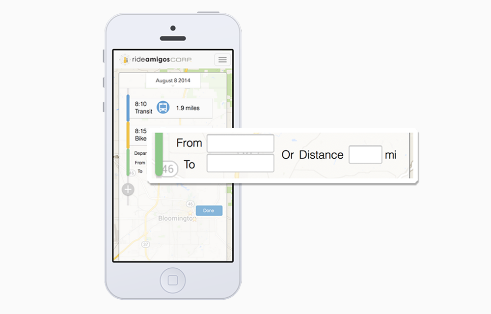
Our clients want to add location logging as an optional feature while keeping the function of typing in distance at the same time. Considering the fact that our clients prefer more data input than data's accuracy, we decided to make location logging as an alternative way to log distance. This design was noted by our clients as "a smart move" to make distance logging easier.
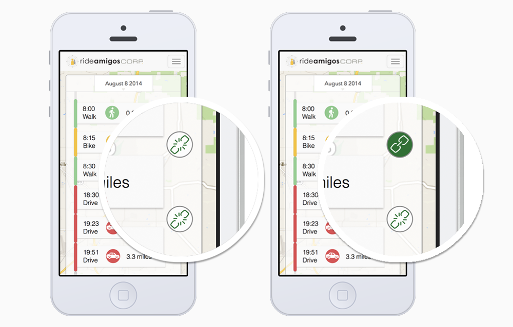
As a must-have feature, logging trip-chaining means users can choose to log the single vehicle drive trips they saved from their travel. However, we found people understand this concept differently, which leads to incorrect data input. Our solution is to notify users that a trip-chaining might have happened but leave it to users to decide. We believe this is the most effective way to record trip-chaining, also to encourage the trip-chaining behavior in the long run.
Design never stops. And be ready for changes. In this project, we had a dispute on whether to adopt a mobile-first design strategy. As we took out the map element from our design, we made a last minute decision to change our final design to a vertical layout, which turned out to be wise decision.
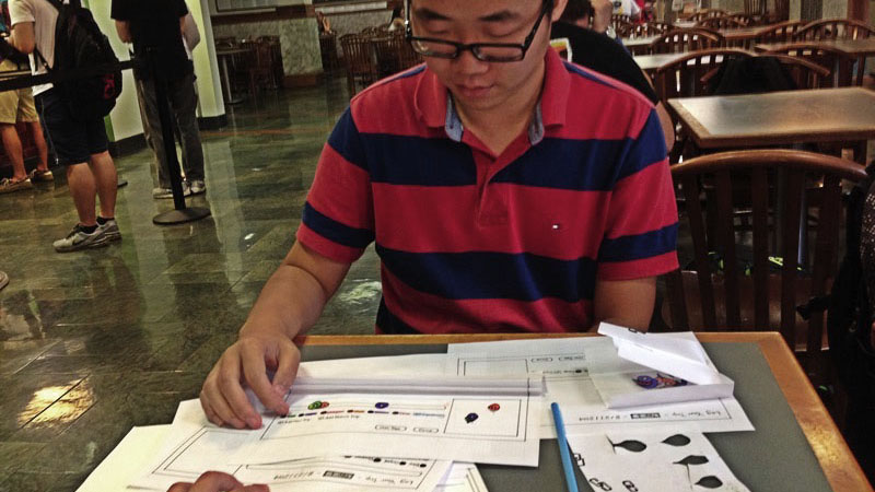
Photo By Lulu Wang
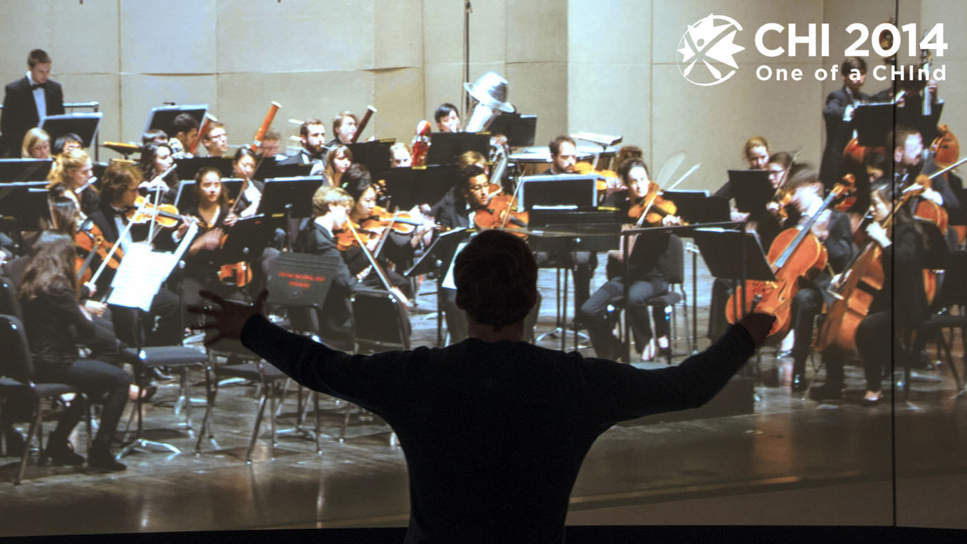
Accepted to CHI2014 Student Design Competition semi-final. (Design Brief)
Co-ideated concepts
Co-conducted researches
Built prototypes for tests
Photo & video shooting
This year's CHI Student Design Challenge is to design an object, interface, system, or service intended to help us to develop and share self-awareness, understanding or appreciation for our body data.
As a unique group, conductors use their entire bodies to communicate with an orchestra to guide musicians through a piece of music. Currently, novice conductors learn basic conducting techniques through solo practice, which lacks factors that exist in a live orchestra rehearsal. However, organizing a live orchestra on demand is expensive and unrealistic for most novice conductors.
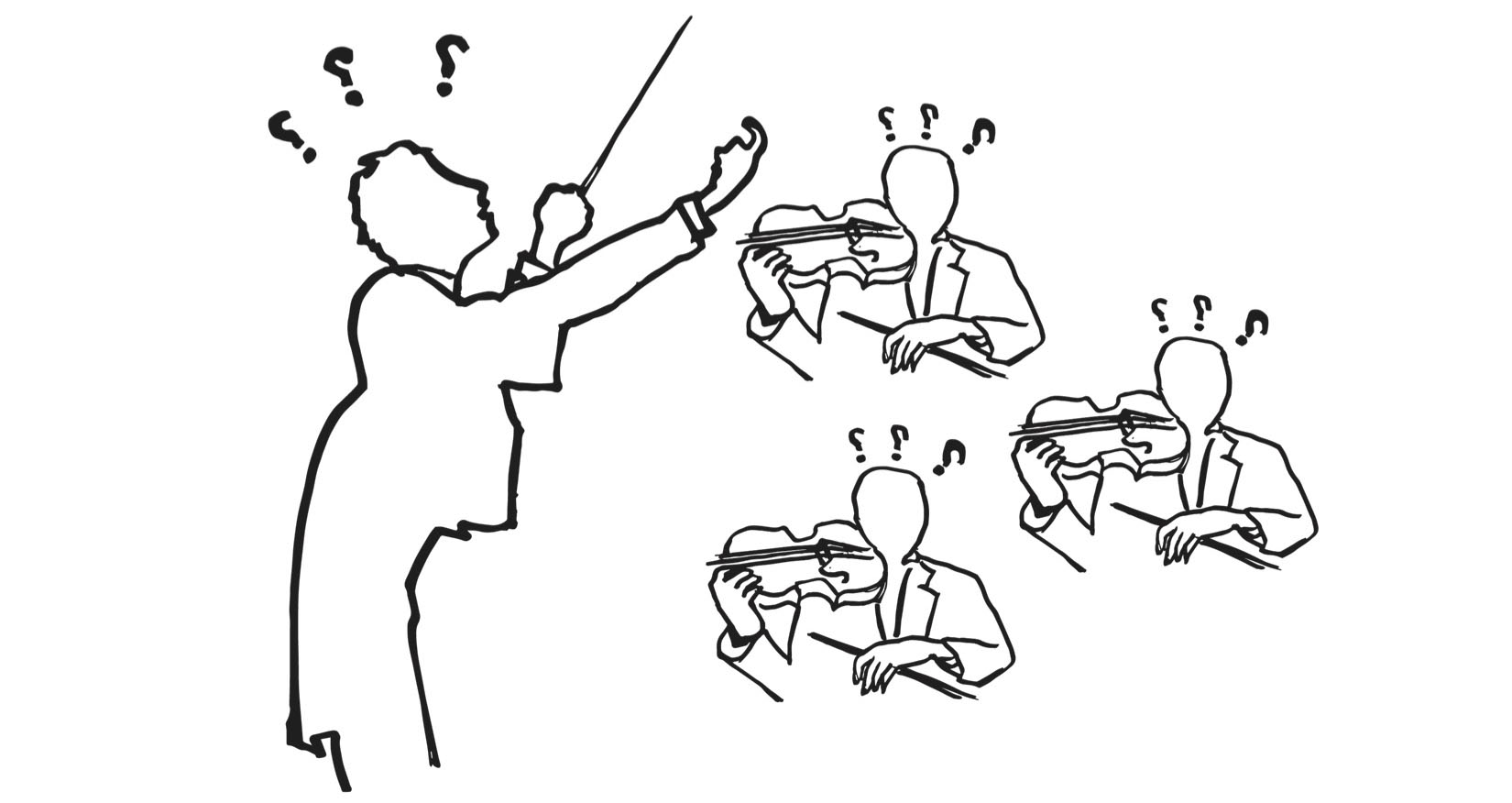
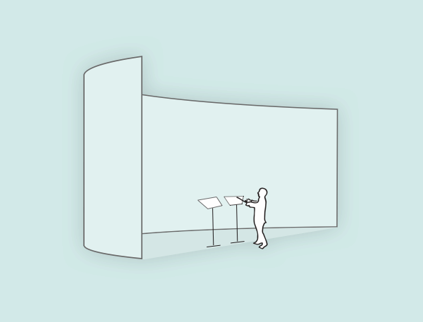
illustration by Lulu Wang
We propose MAES:TRO, a practice system where novice conductors can learn about and reflect upon their hand gestures, body motions, facial expressions, and eye-gazing directions to achieve mastery of conducting more effectively.
MAES:TRO system consists of a projector, a digital score stand and 3 perceptual cameras are equipped to facilitate the practice experience.
track and record conductor's hand gestures, body motions, facial expressions and eye-gazing directions.
projects a virtual responsive orchestra band on to a semi-circular screen.
serves as a control panel for conductors to select scores, choose orchestral components, start/pause rehearsal and rewiew recorded practice.
The user research methods we adopted throughout the whole process include:
We interviewed 4 student conductors, a conducting professor and a music informatics professor.
We conducted two observations in both graduate level conducting class and orchestral practice.
We went through 30+ papers and textbooks on conducting and current music technology.
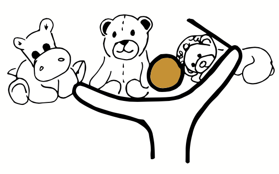
Conductors need visual aids to allocate their attention to different sections of an orchestra.
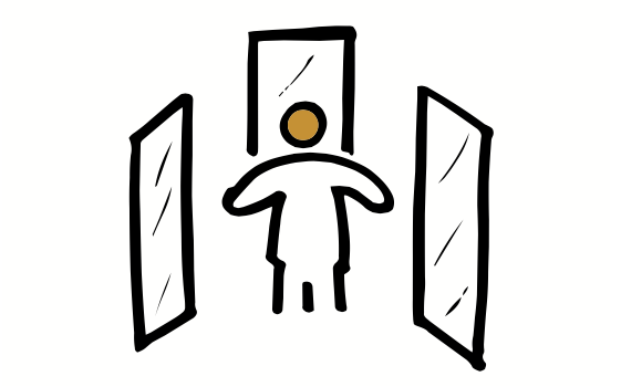
Conductors want to see themselves from different angles.
Conductors want to be in control of the music.
We rapidly prototyped our digital stand interface using Powerpoint and tested it with 3 student conductors.
According to their feedback we dropped some features that might be distracting like real time visual cues and auto-correction system.
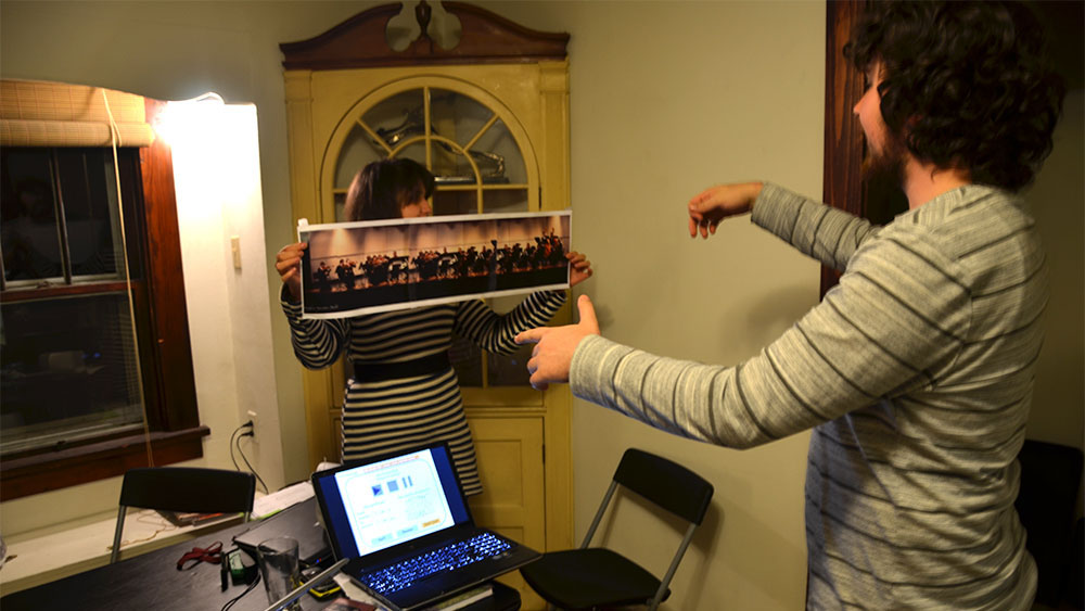
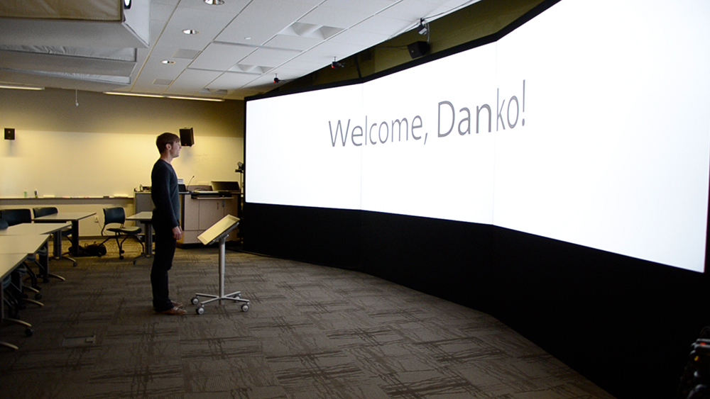
To better evaluate our design, we utilized Indiana University's Advanced Visualization Lab to create higher fidelity test environment with rounded screens and a digital tablet stand.
We invited a PhD student conductor to join our Wizard of Oz testing, where all interactions between the screens and the stand were controlled by us. The test result was quite positive and satisfying.
During this 6-month-project, I had my first experience to participate in all different phases of a user-centered design process. Interviews and observation in-the-wild let me know that user-centeredness is no joke.
Also, I am surprised by the fact that many technologies are not easily acceptable for some population groups. For example conductors will trust on their own judgement and reflections rather than computer algorithms. This helps me to consider more factors in future design work.
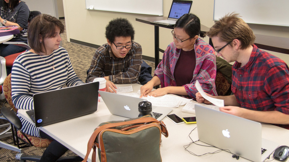
Photo By Craig Harkness
3 months
Co-iterated on the concept
Co-evaluated the prototype
Coding and debugging
Video shooting
Undoubtedly, mobile phone is an indispensable part of modern life. As harbor of personal information and communication, mobile phone asks for people's attention from time to time.
However, it's not always safe to stare at your phone. For example, if you are texting while walking, you may 1) run into someone others; 2) run into obstacles or blocks; 3) block the way of other pedestrians.
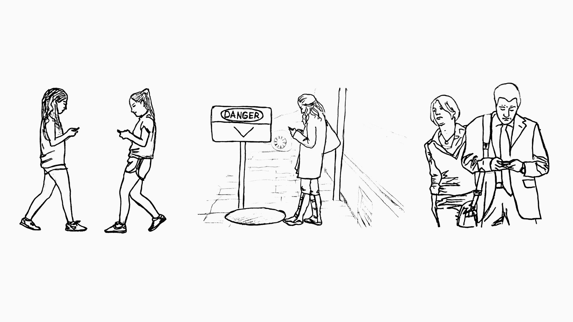
illustration by Lulu Wang
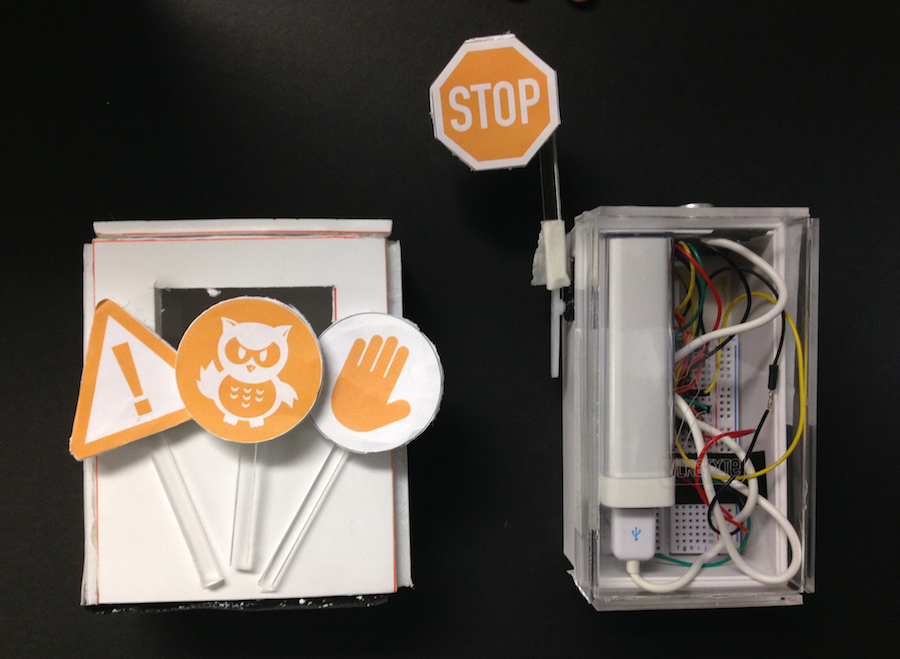
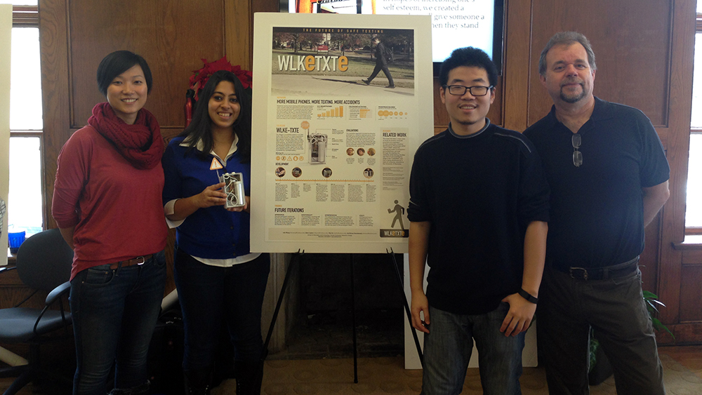
We built WLKeTEXe, a portable device that aims to reduce the negative public impact of people who text while walking. It not only notifies user the potential danger ahead, but also provides opportunity for self-reflection of texting habits.
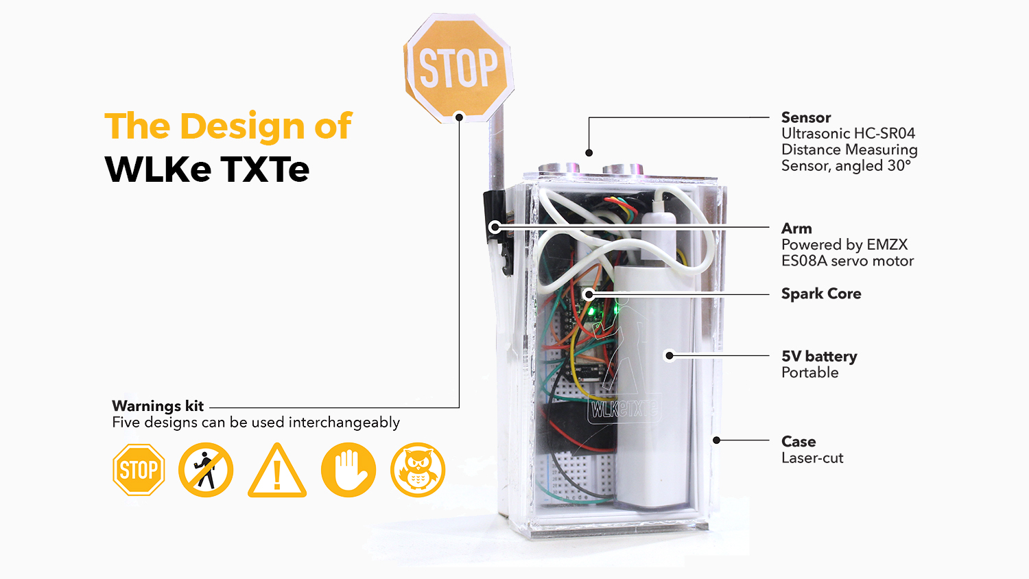
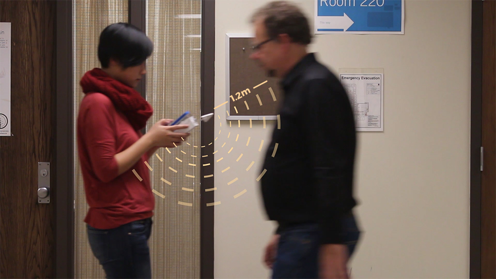
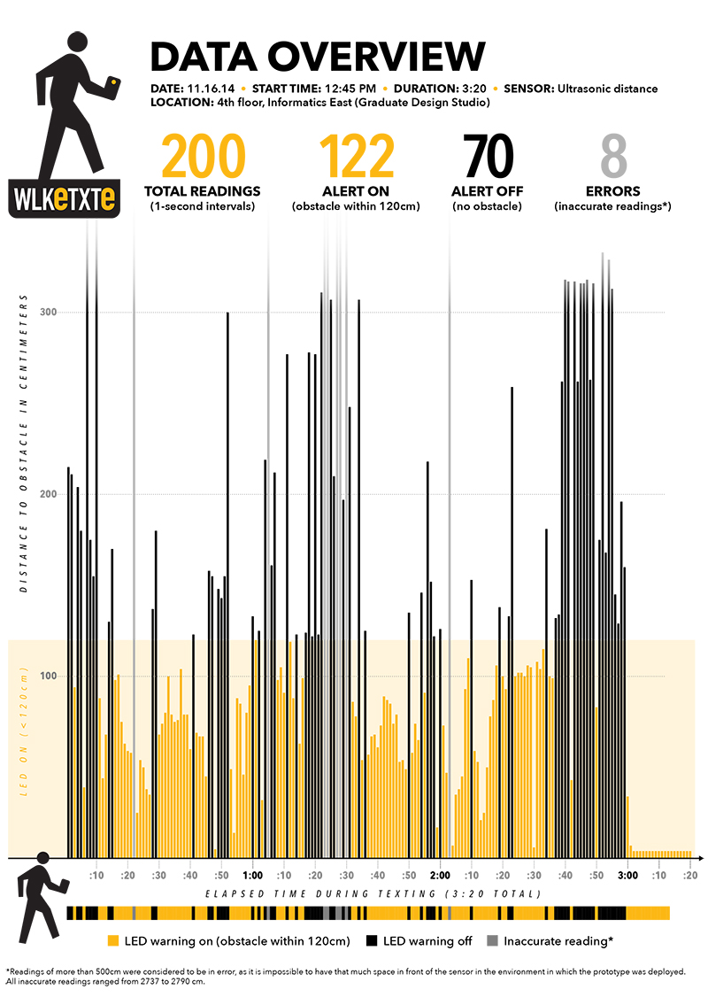
Equipped with HC-SR04 ultrasonic distance sensor, WLKeTXTe is able to detect the closest object within upto 4 meters. Combined with our research and testing, we found 1.2 meters works best with average walking speed thus set it as the trigger range of our design.
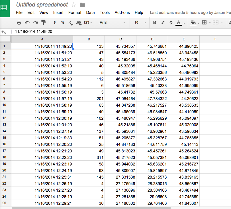
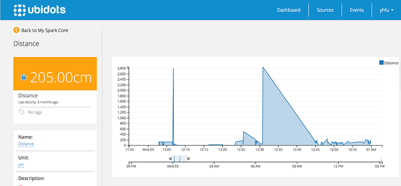
We used SparkCore as the hardware development platform, which is a WiFi antenna included Arduino chip that can send sensor data to cloud. With the help of SparkCore, WLKeTEXe can keep record of user's mobile usage and visualize it in a meaningful way to help users reflect on their behavior.
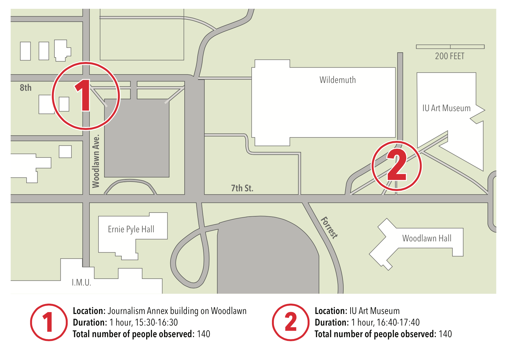
We observed the pedestrians in two different spots on campus for primary research. We also conducted 1 hour long interviews each with 2 undergraduate college students about their experiences and opinions with texting while walking.
Based on our research, we decided to focus on developing an auxiliary device that can respond to surroundings mobile phone users.
Besides sketching and brainstorming, we made two Vine video prototypes in order to test out our ideas in an early stage. We got generally positive feedbacks and some helpful suggestions.
Since none of our team members come from a coding background, we learned everything by doing. From programming in C to setting up a RESTful API, from 3D Printing to laser cutting, we were always willing to experiment new things. In total, we went through 3 rounds of iterations to build our final prototype.
In 4 weeks, I learned to use Spark Command Line interface and programm in C to make our prototype work without bugs.
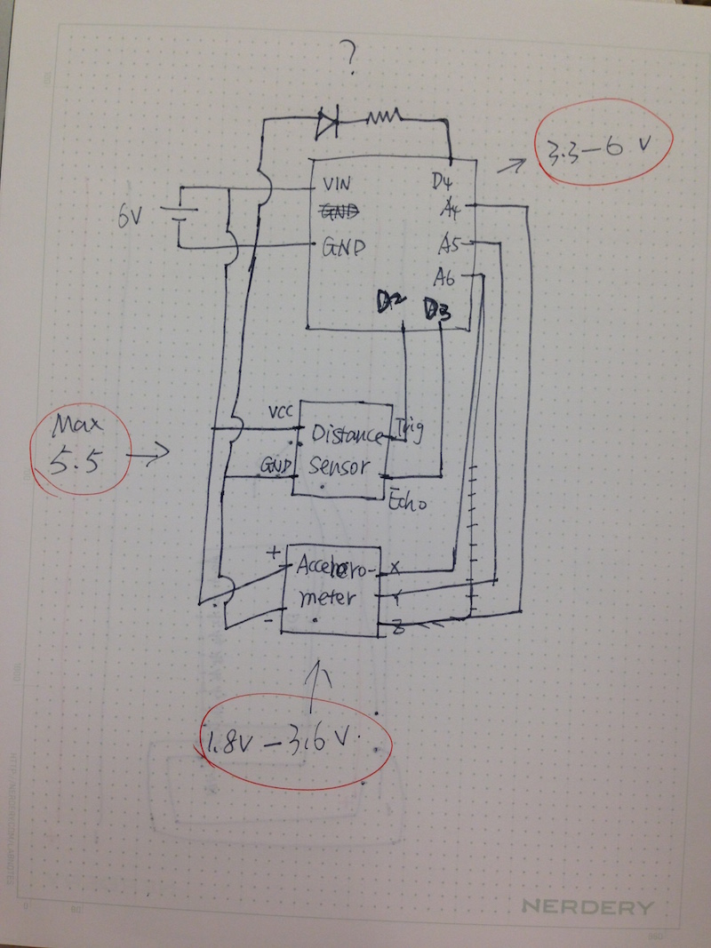
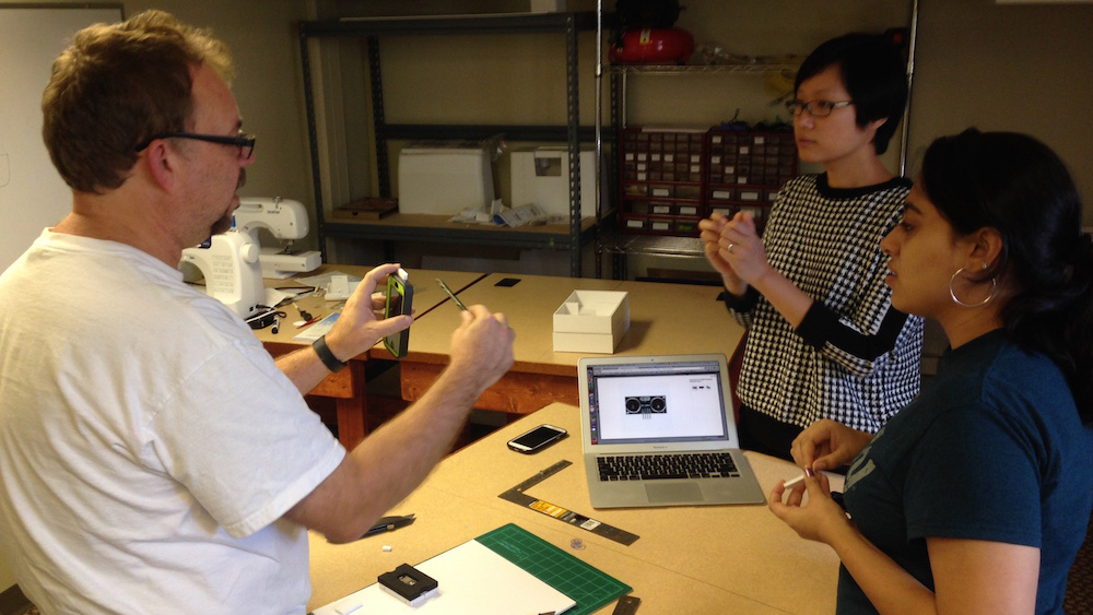
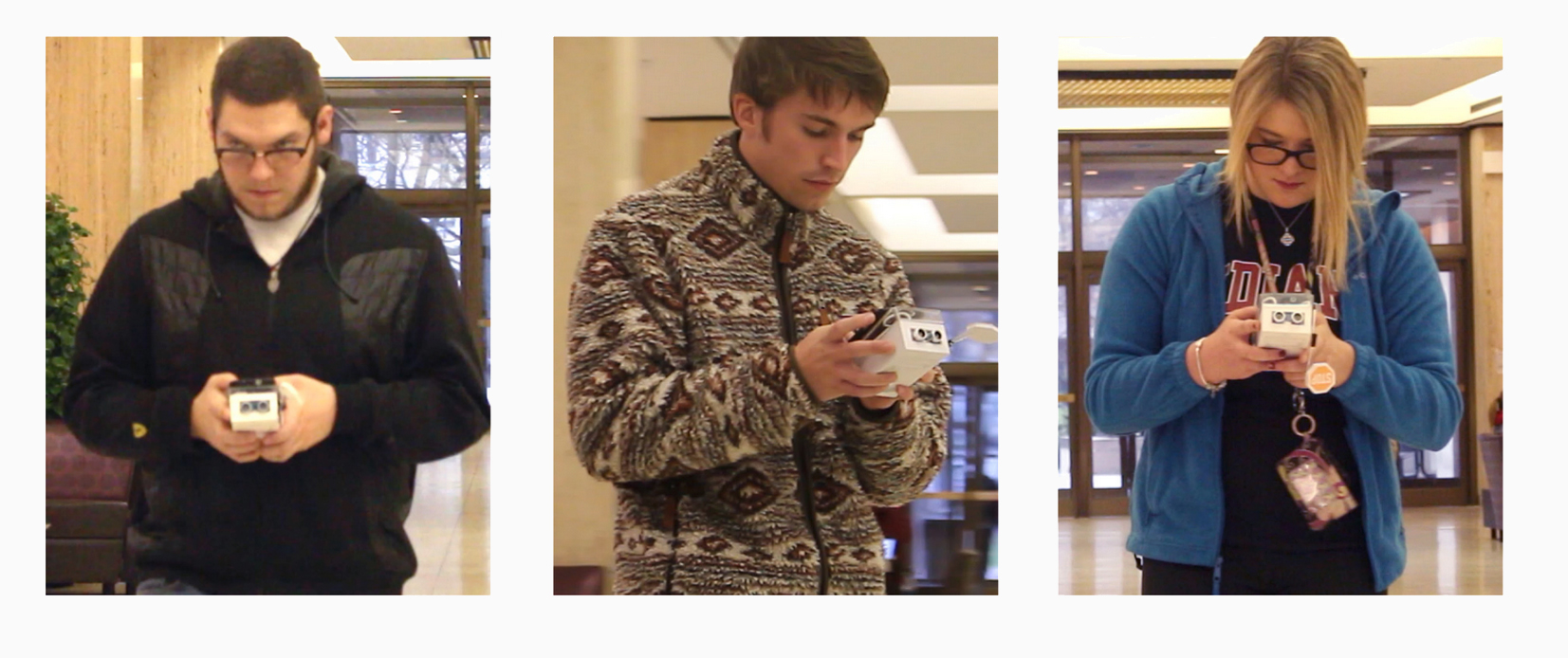
We evaluated our design with 3 students. We observed them walk around with their mobile phone and WLKeTXTe while we sent text messages to them. Then we interviewed them immedately after our observation. Their feedback was positive and also gave us future direction on designing digital devices that are "responsive" to environment.
Work with limitations. The most challenging part of this project is that none of us have electric engineering/coding background. Though we managed to learn as much as possible, there are still plenty of things left to be desired. Therefore we decided to embrace these limitations to better contrain our design decisions. For example, not being able to implement notificiation in smartphone OS led to the burst of our creativity using a physical moter showing a "stop sign". I learned to be comfortable with limitations and even to leverage on them in design process.
1 Week
Co-ideated design concepts
Made interactive prototype
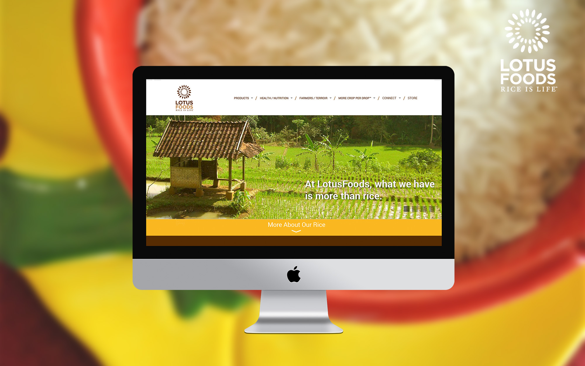
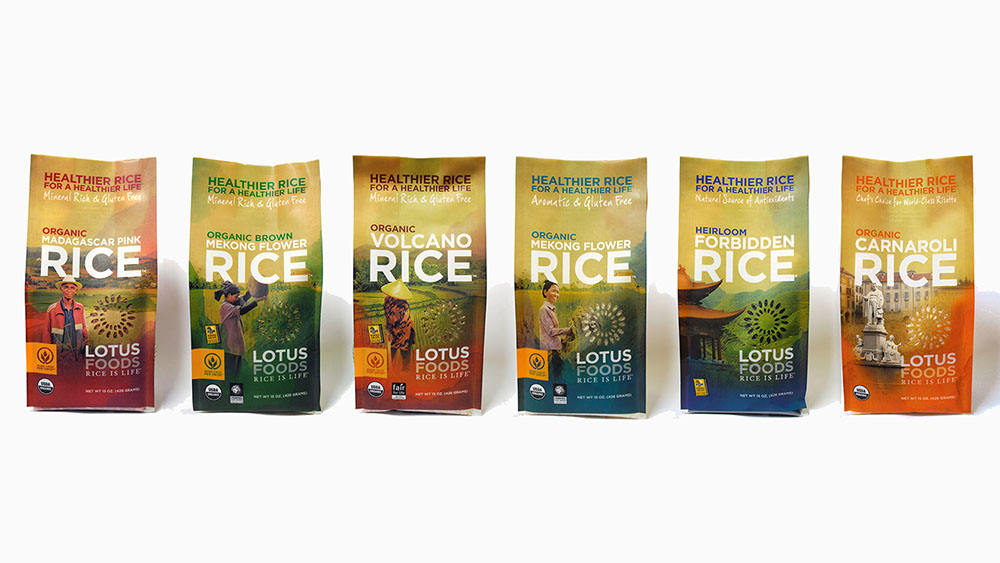
Lotus Foods is a US leading brand for specialty rice category. Apart from selling rice, they've been trying to promote concepts like organic, natural foods, fair trade, gluten free and non-GMO rice for years.
As our client, Lotus Foods are looking for actionable redesign recommendations for their website and web messaging, hence making their brand more appealing and accessible to mainstream audience.
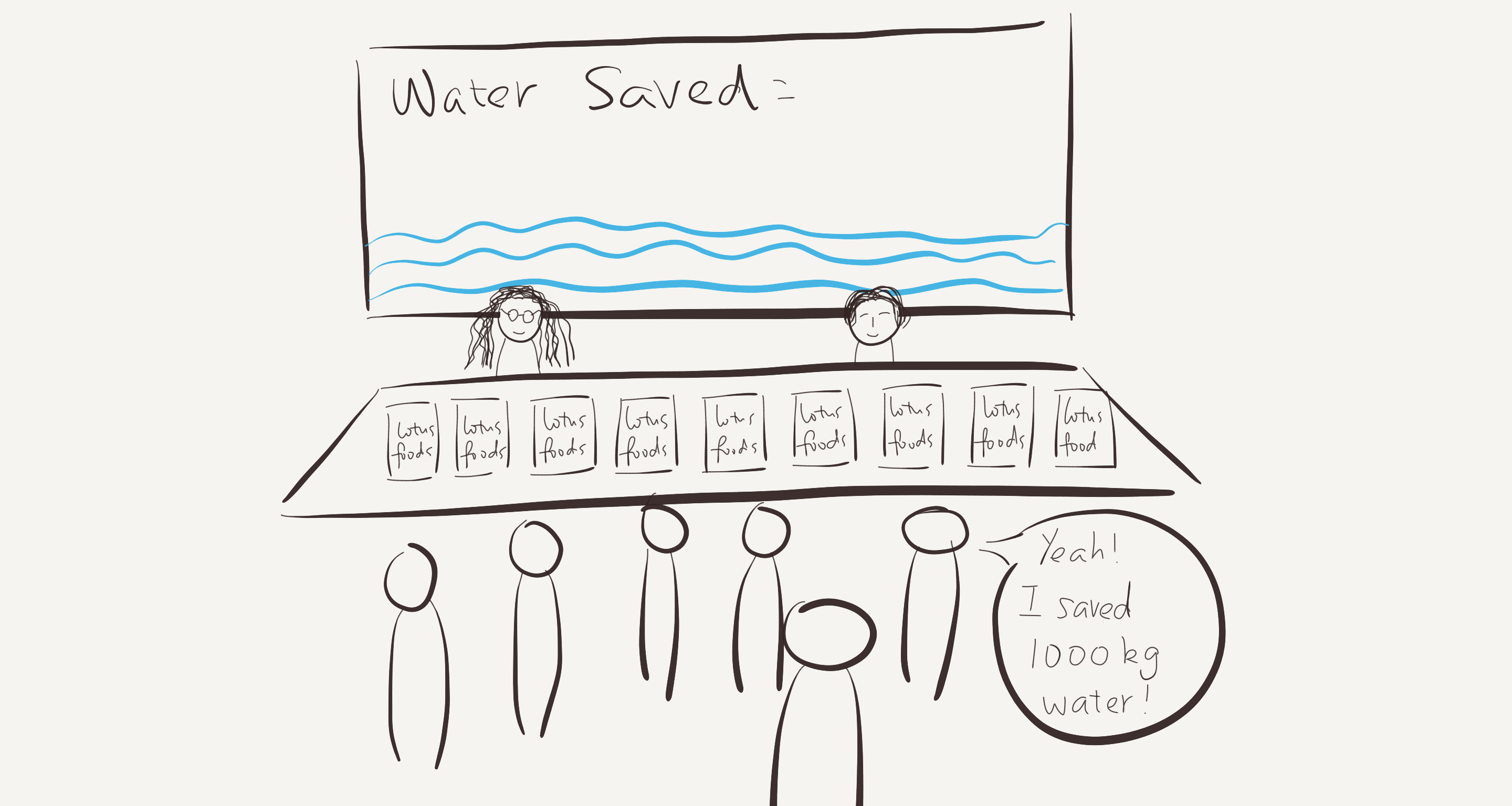
We created a 3-step design solution for Lotus Foods to implement. The overall goal of our design is to strengthen Lotus Foods brand awareness by improving browsing experience, forming online community and holding branding campaigns.
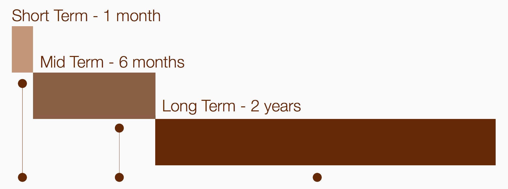
For short-term redesign our goal is to quickly fix some existing usability issues without changing the current Information Architecture. I created static website visuals to convey our idea in a clear way.
For mid-term our goal is a total redesign of Lotus Foods site. We simplified the interaction flows and IA of the site so it is easier to navigate and use. Also, we added a new online community catagory to combine existing resources with user generate contents. We built an interactive prototype to demonstrate our design.
For long-term strategy we proposed some possible offline marketing campaigns that can leverage the community cultivated online. Our goal is to promote Lotus Foods brand and their concepts to mainstream market.
Winner of the Teradata Rapid Design for Slow Change class design challenge (1st out of 12)
Co-ideated design concepts
Co-wireframed design solution
Made concept walkthrough video
Finalist of the SapientNitro Rapid Design for Slow Change class design challenge (3 out of 12)
Co-ideated design concepts
Co-wireframed design solution
Made concept walkthrough video
Winner of the IBM Rapid Design for Slow Change class design challenge (2 tied out of 12)
Brainstormed design concepts
Co-ideated and co-drafted strategy
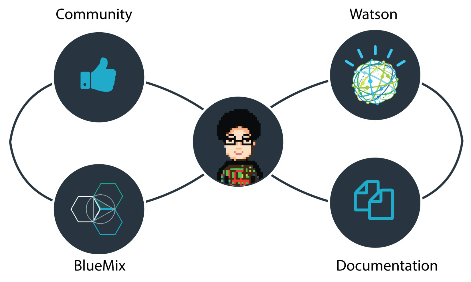
This project by IBM Bluemix raises an interesting challenge for us: how to improve the user experience of a command line interface? (CLI)
As a website front-end for cloud application depolyment, Bluemix would like us to think beyond graphic user interface and reimagine user experience of using Cloud Foundary CLI, which serves an important role in the cloud deployment process.

Given the breadth of project, we decided to narrow down the scope of this project first. After several interviews with developers and clients, we focused on one common problem that programmers will encounter when using CLI: Handling error messages.
Dealing with errors and debugging constitutes a huge part of the development process. We disocvered that like other CLIs, the error messages of Cloud Foundry are constructed out of arcane codes, unclear information, and lack of further instructions.
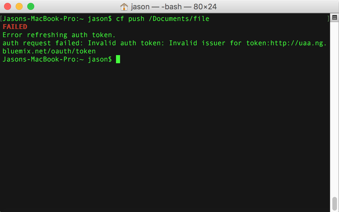
To better understand how developers' current workflow of handling error messages in CLI, we interviewed Software Development Engineers from IBM and Computer Science Alumns from IU. By directly talking to them, we were able to get familiar with not only the way developers work, but also their own culture and love-and-hate relationship with CLI.
It's a solution that's both fast and easy to remember, because it's personalized. That's the sort of strength--any CLI, as long as it's fully featured--can get you.”
Use of commands isn’t always clear, even with the given documentation.
Developers like CLI because it's efficient, focused and just gets things done. Our design should strive not to distract users from their workflow.
Developers have Do-it-myself spirits. They like to dig things out and don't like to be treated as kids. Our design should alway be an option instead of a necessity.

When searching error messages, developers are not looking for descriptions but solutions. Our design could leverage on IBM's own Watson information interpretation capbility to offer better solutions.
Within CLI, we propose to progressively train IBM's Watson to help users find solutions of error messages from resources like Cloud Foundary, Bluemix documentation, developer forums and user feedbacks.
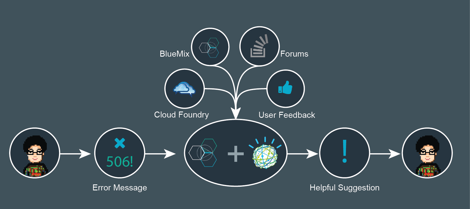
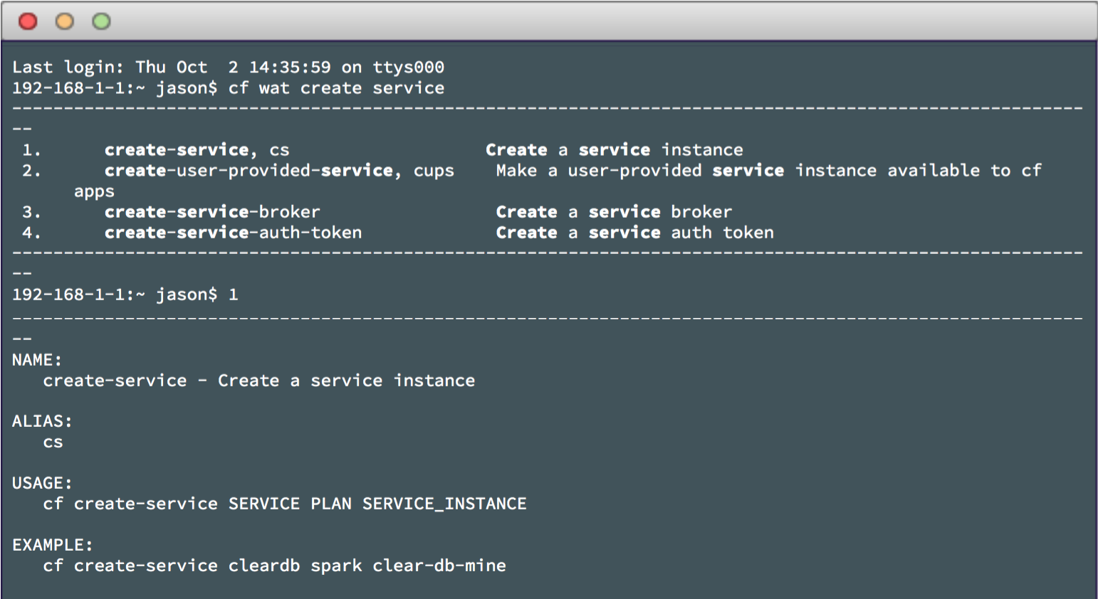
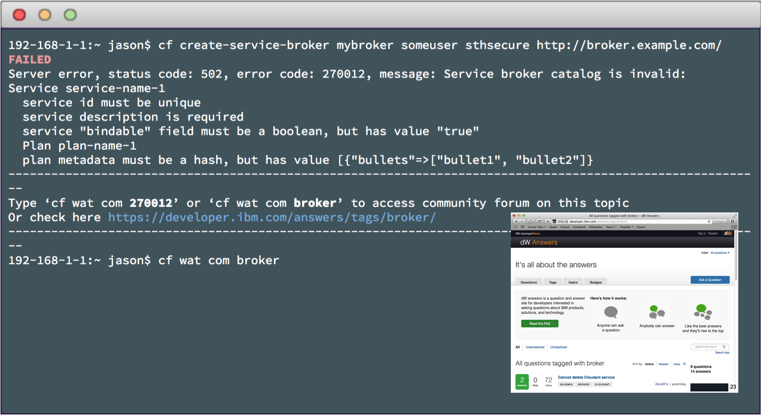
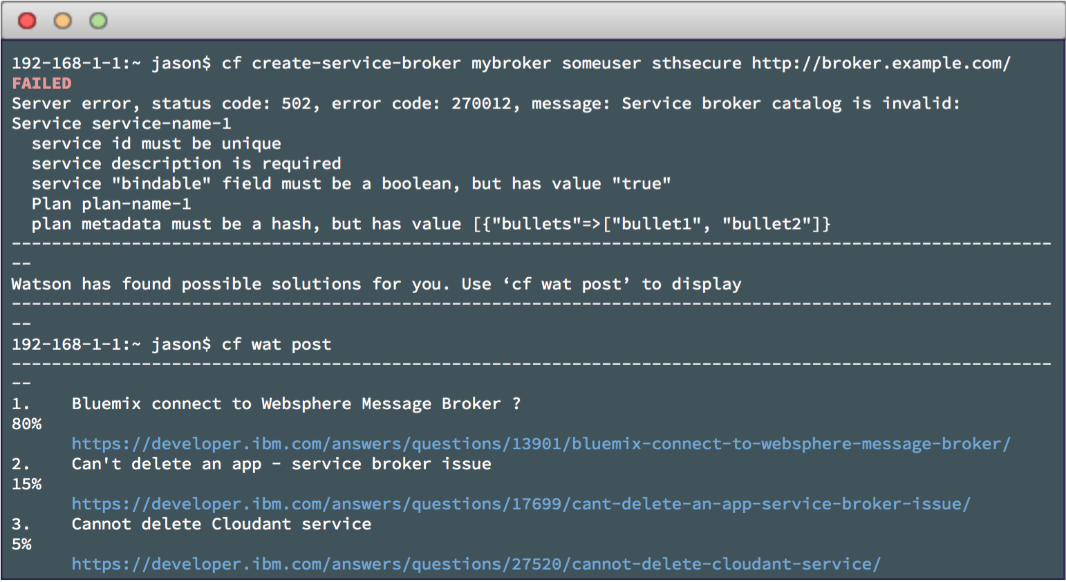
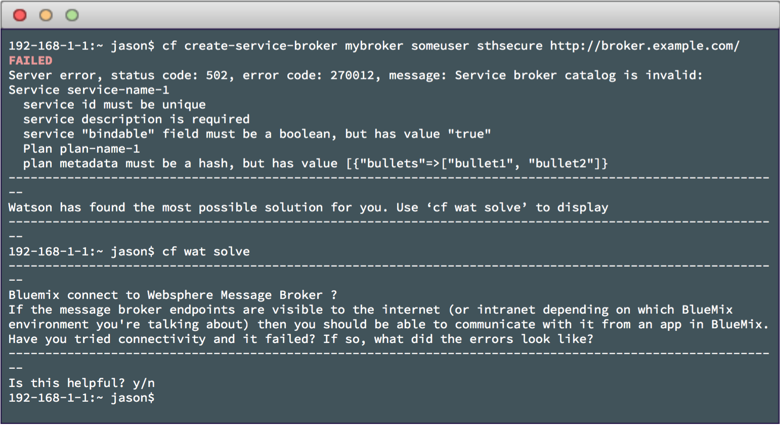
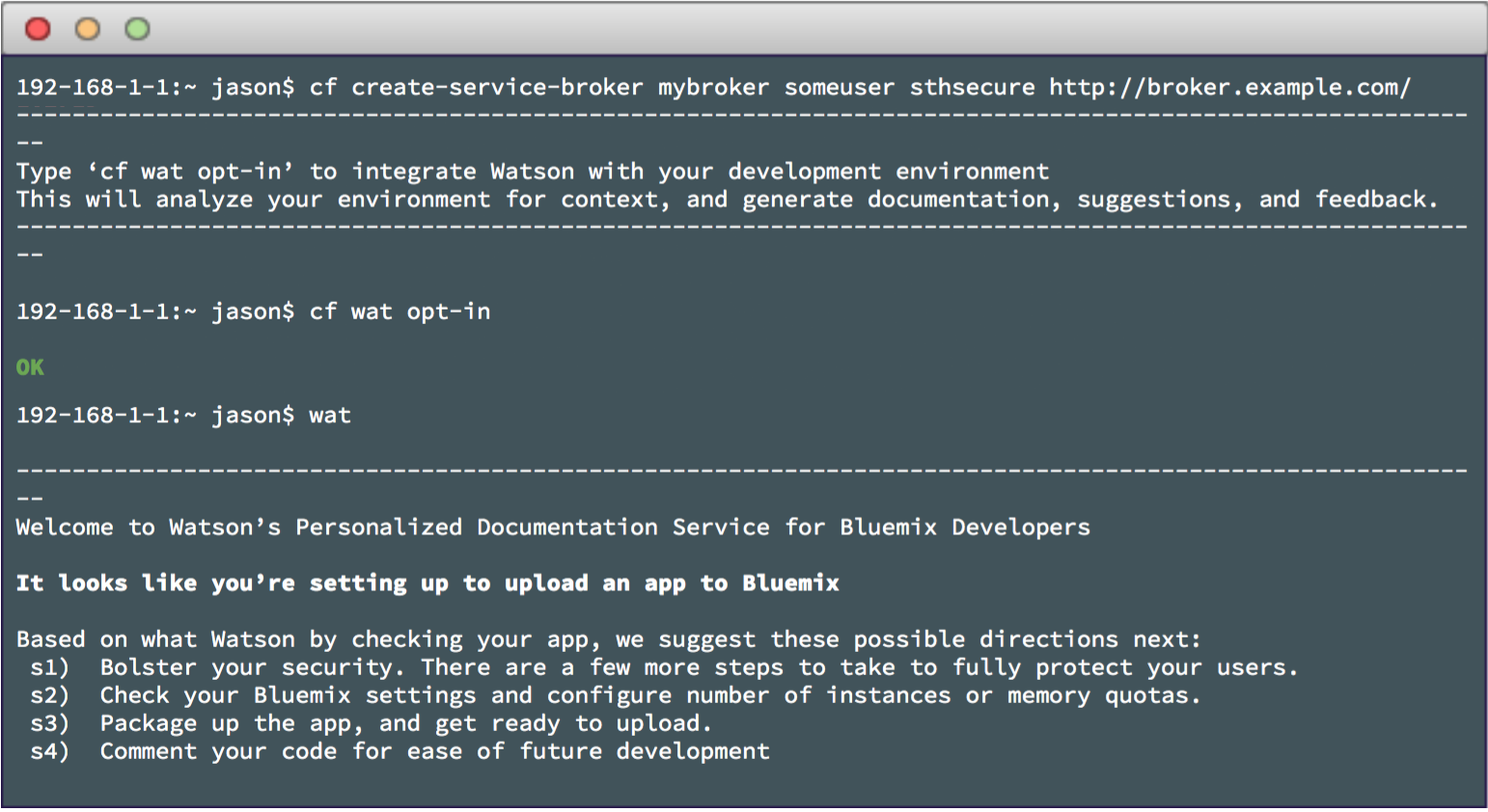
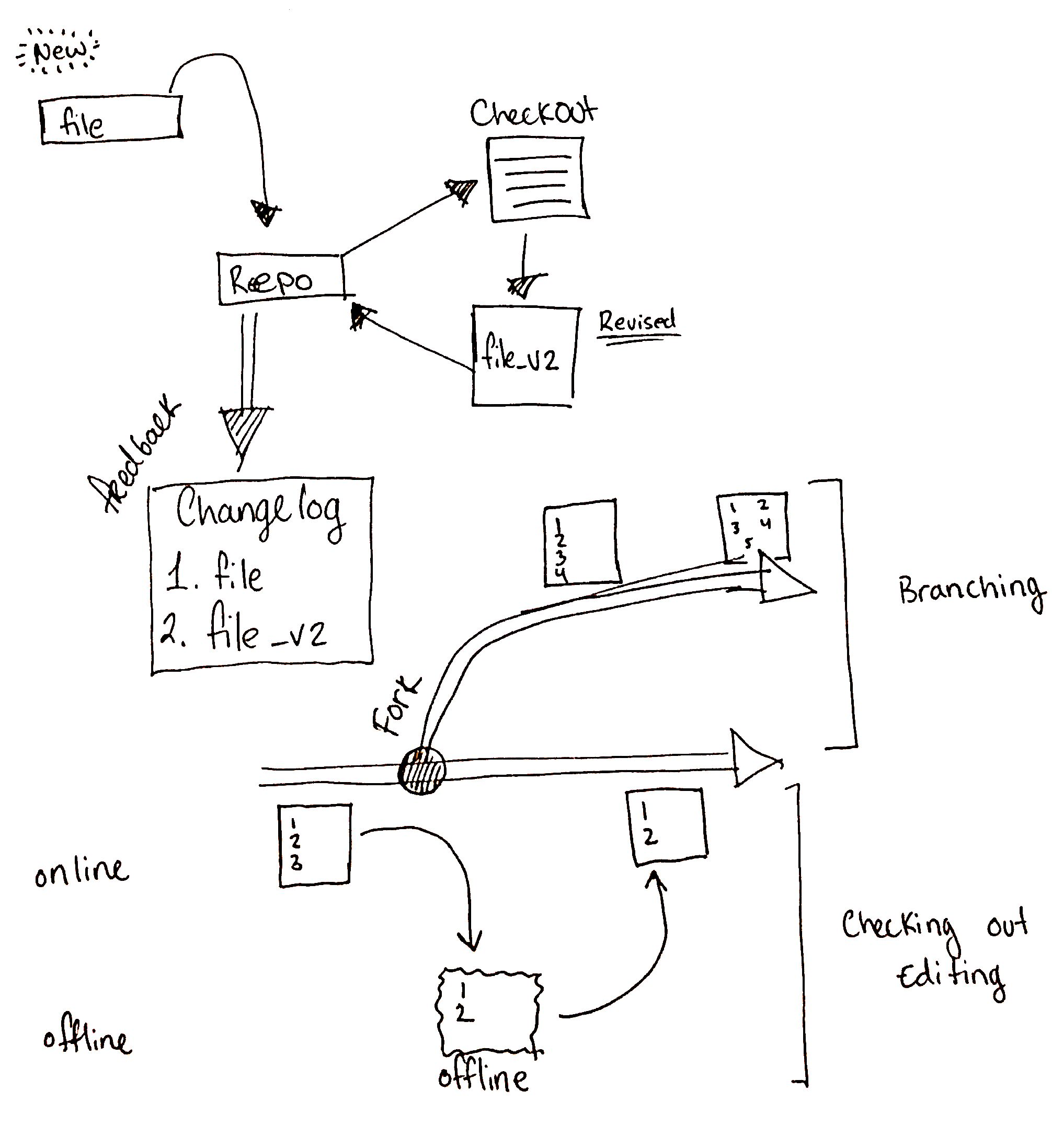
Based on implementation difficulty level, our 5-step plan gradually builds upon itself using the data collected at each stage.
Keyword search in CLI within Cloud Foundry documentation.
Error message generates link to Bluemix Developer Community.
Error message generates links to relevant community posts.
Potential solution is displayed with the error message.
Watson gives contextual answers like your development friend.
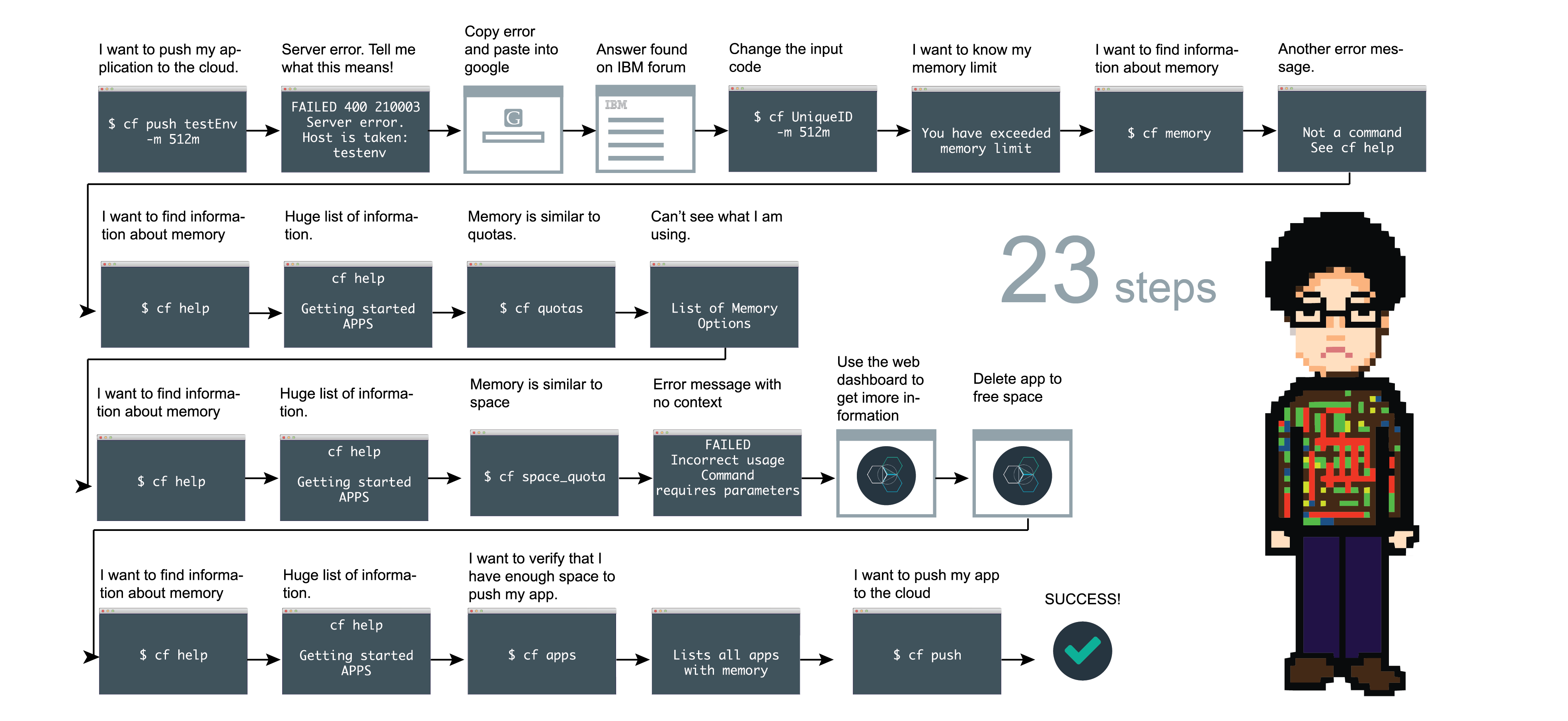 Before
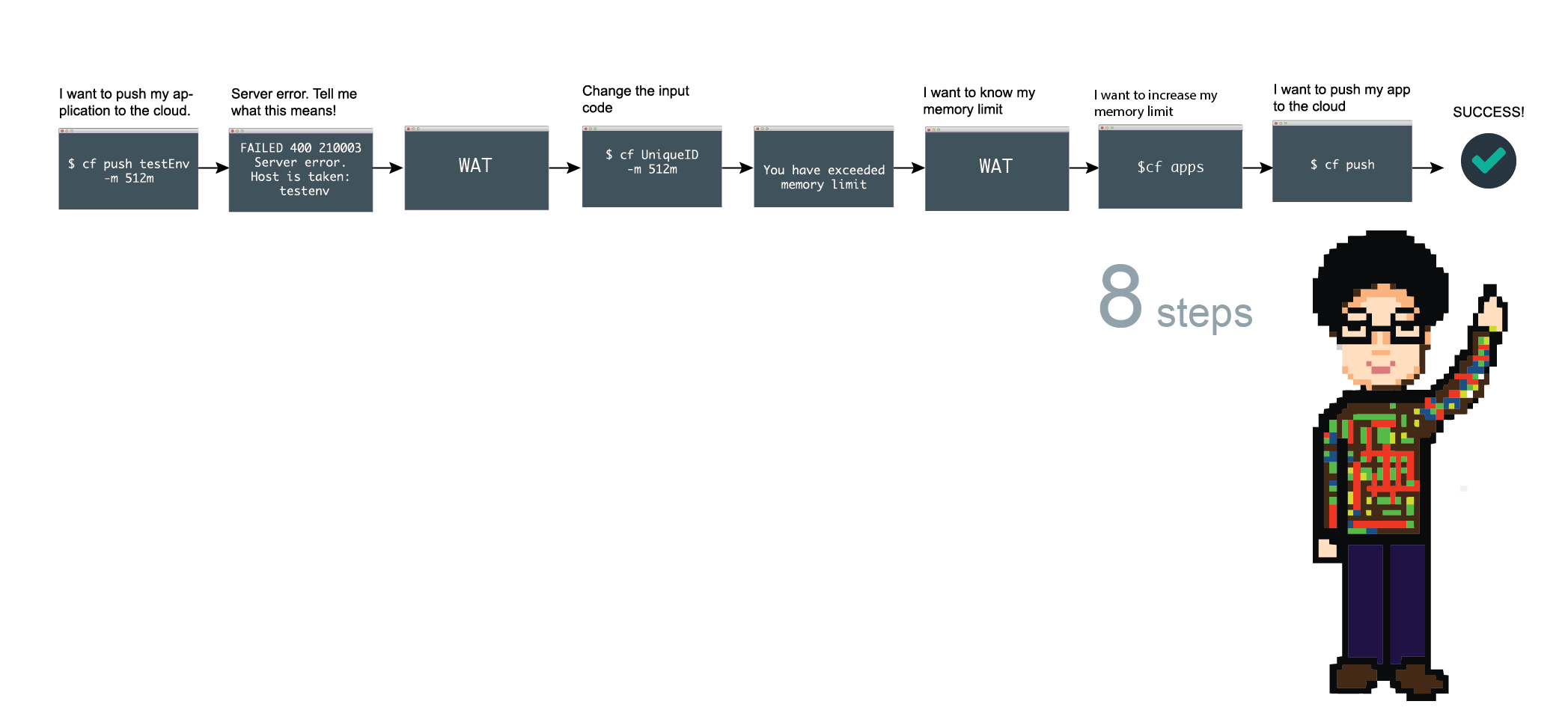 After
After
We believe the best UX of CLI is all about being supportive at the right time.
By involving developers early, we expect to move them into a virtuous circle of quality and participation. With better error messages, there will be a greater community using Bluemix and creating supportive contents. With more user generated contents, Watson returned better, more contextually aware results.
Rethink the value of UX. It's easy to think that UX is about beautiful interface, pixel-perfect specs and well-polished prototypes. But UX is not only about that. In fact, CLI doesn't need GUI and developers don't want you to make decisions for them. This project keeps reminding me the core value of UX lies in the process, not in the end result.
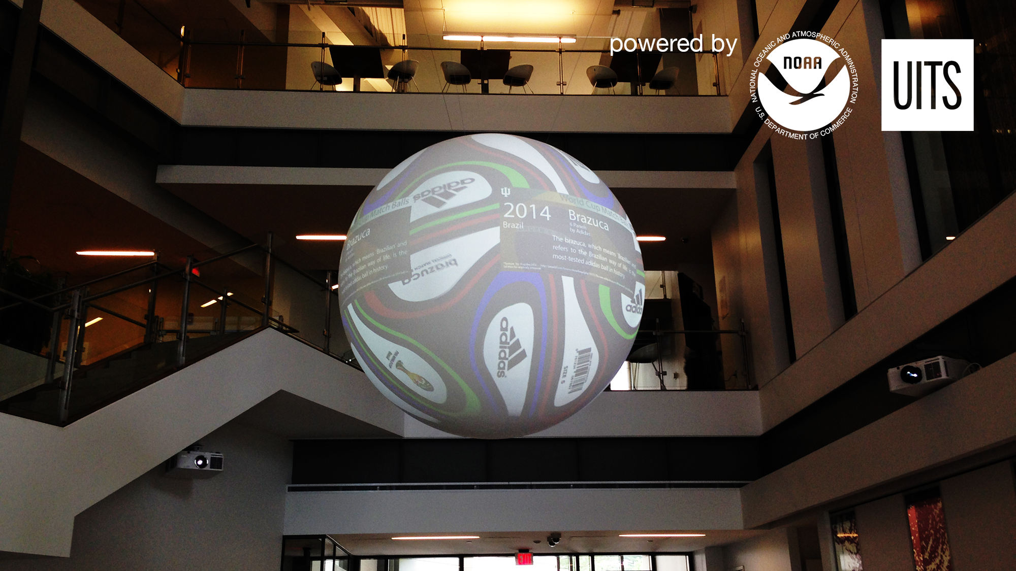
10 Weeks (06/2014 to 08/2014)
Sketched out visualization ideas
Coded with Processing
Evaluated and redesigned existing applications
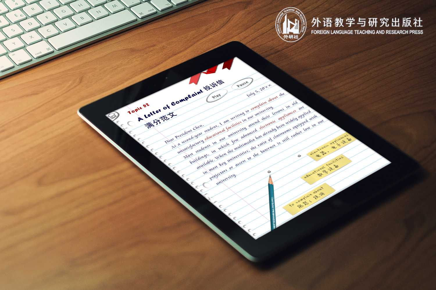
6 Weeks (02/2013 to 03/2013)
Flora Wang
Designed interface and interactions
Coordinated with PM
This is a short motion graphic video made for a concept app of Whirlpool's Everyday, Care campaign.
Illustrator
After Effects
This is a video mockup designed for an exhibition of font designer Matthew Carter. This iPad interactive catalog will show how "ubiqutous" Matthew Carter's fonts are.
Illustrator
After Effects
Premiere
This is a project for my Graphic Design course. I designed an instructional cookbook for making Chinese Golden Dumplings. I also wrote a visual precedent paper on how I exlpored my own visual style by designing this book.
Illustrator
Photoshop
InDesign
This is a visual identity design for first annual show, HCI/dX.
Team mate: Monet
Illustrator
Photoshop
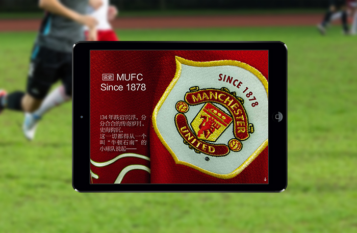
This is an award-winning interactive iPad magzine I designed for Manchester United Football Club during my undergraduate study in China. (Video voiceover in Chinese)
Photoshop
InDesign

